


Your choice of colors is one of the most important decisions of wedding planning. It sets the tone for the day and ties all your elements together, from the linens to the stationery and flowers. But unless you’re a professional designer, choosing the right pigments and incorporating them in a sophisticated fashion can feel like a daunting task. Too many colors and your celebration may look disjointed. Overuse of the same color can make your celebration look too matchy-matchy.
Experts say there’s a simple solution: embrace the easy-to-follow recipe of the modern monochromatic wedding. To start, pick a single hue that you want to dominate your design. Consider your favorite color, one that complements your venue, or one that speaks to the season in which you’re getting married.
Next, select a few shades, tones, and tints from the same or a closely related color family. Add in one to three neutrals (think: white, cream, tan, brown, or gray). Finally, consider including an accent color or a metallic for added visual interest.
The resulting look should be nuanced and refined – not overwrought – thanks to the variety of analogous shades and tones. By following these simple steps, anyone can create a cohesive palette.
Now all that’s left to do is select your shade. Thankfully, we’ve presented plenty of options and examples to get you started – think: pretty much any color of the rainbow, and then some.
Red
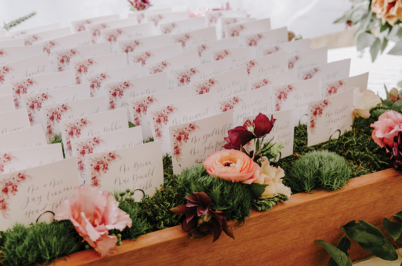
Deep red pops against a crisp white neutral base with subtle navy accents and gold embellishments.
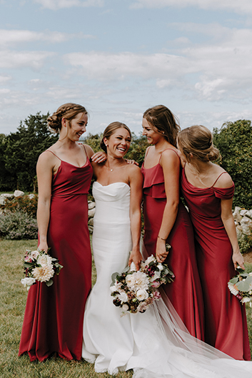
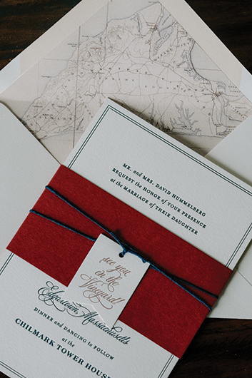
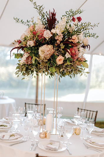
Photos: Larisa Stinga I Wedding Planner: Plan It Martha’s Vineyard I Flowers: Aubrey Maria Designs | Stationery: Gus & Ruby I Calligraphy + Design: Maidenwood Press I Rentals: Big Sky Tent and Party Rentals
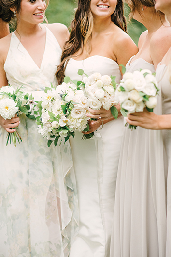
Pink
Coral charm peonies steal the show in this shades-of-pink celebration accented by white, gray, and gold.
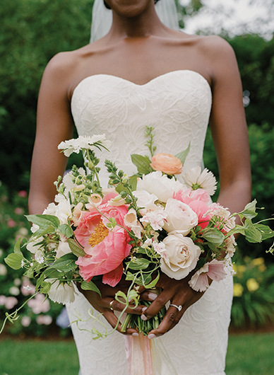
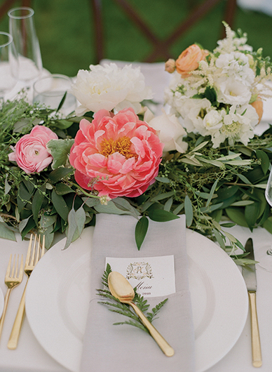
Photos: Jocelyn Filley I Wedding Planner: KG Events & Design I Flowers: Morrice Florist | Calligraphy + Design: Chick Invitations & Design I Rentals: Big Sky Tent and Party Rentals
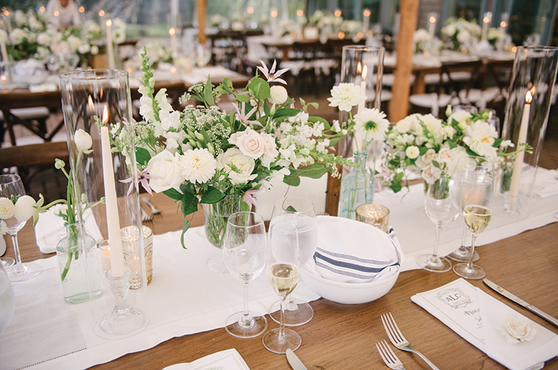
Yellow
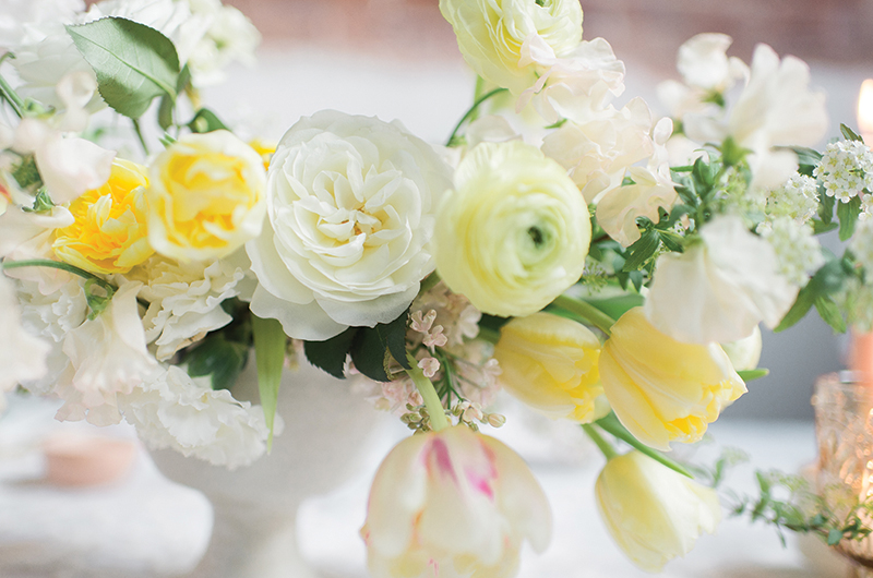
Delicate yellow tones pair with white for a dreamy combination. Minimal blue and pink notes complete the look.
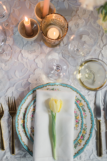
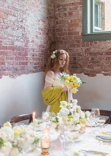
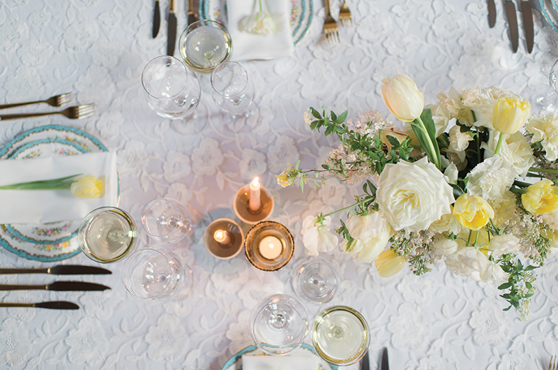
Photos: Elizabeth Willis I Flowers + Styling: Emily Coulter of Morrice Florist + Elizabeth Patterson of Ailish Floral | Props + Rentals: Morrice Florist + Big Sky Tent and Party Rentals
Green
White, off-white, and gray neutrals balance modulated greens. Subtle blue and metallic details add nuance.
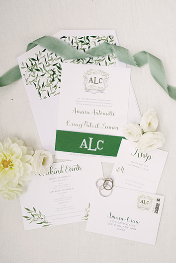
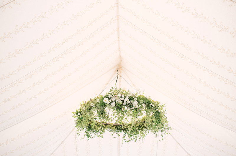
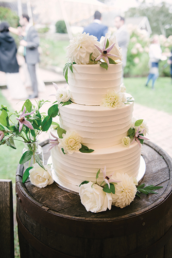
Photos: Eva Lin I Wedding Planner: KG Events & Design I Flowers: Morrice Florist I Stationery: Mulberry & Elm | Cake: Val Cakes I Rentals: Big Sky Tent and Party Rentals
Blue
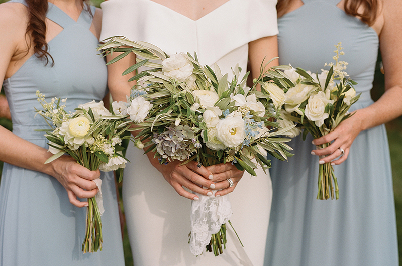
Pale blues pair with white, brown, and gray neutrals for an understated look accented by silver and yellow.
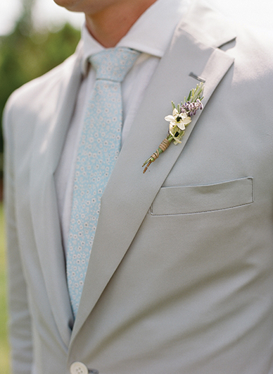
Photos: Jocelyn Filley I Wedding Planner: KG Events & Design I Flowers: Tea Lane Farm | Stationery: Rabbit Rabbit Design House I Rentals: Big Sky Tent and Party Rentals
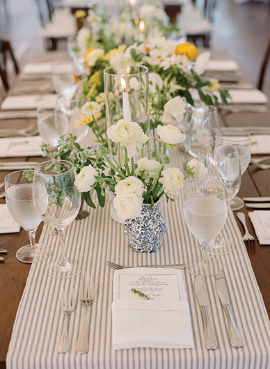
Purple
An array of purple tones is complemented by white and cream. Given the tonal range, no accent color is needed.
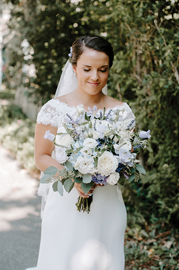
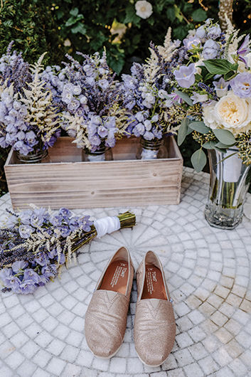
Photos: Larisa Stinga I Wedding Planner: Plan It Martha’s Vineyard I Flowers: Aubrey Maria Designs | Calligraphy: Maidenwood Press I Rentals: Seaside Celebrations Tent & Party Rentals
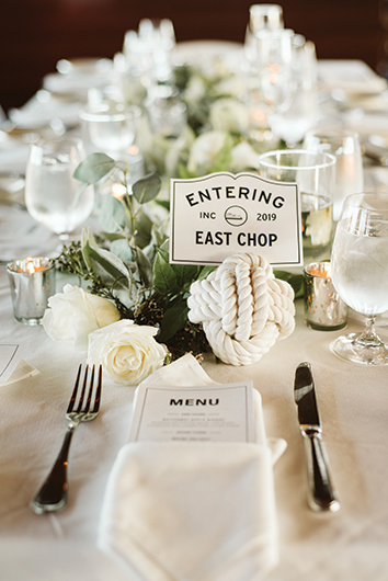
Black
A classic black-and-shades-of-white color palette inspired by the ferry is elevated by gray and gold accents.